
ማብራሪያ
ClassicAddons Content Blocks is a premium-quality, lightweight block library for the native WordPress editor. Build landing pages, marketing sections and sales pages with polished, conversion-focused blocks — without installing a heavy page builder and without touching a line of code.
Every block is server-rendered (dynamic PHP), ships zero frontend JavaScript, and only loads its own CSS on pages that actually use it. The result: clean markup, fast pages and great Core Web Vitals.
Why you’ll love it
- ⚡ Fast & lightweight — no jQuery, no frontend JS, per-block CSS loaded on demand.
- 🎨 Genuinely designed — sensible defaults that look great out of the box, plus deep customization when you want it.
- 📱 Fully responsive — separate desktop / tablet / mobile controls for typography, padding and visibility.
- ♿ Accessible — semantic HTML, ARIA labels, keyboard-friendly controls and reduced-motion support.
- 🔍 SEO-friendly — selectable heading tags (H1–H6) and optional FAQ schema (JSON-LD).
- 🧩 Composable — cards drop straight into core Columns / Grid layouts and stretch to equal height.
- 🧱 Native editor — built on
block.json, the Block Supports API and standard hooks. Works with block themes and Full Site Editing.
The blocks
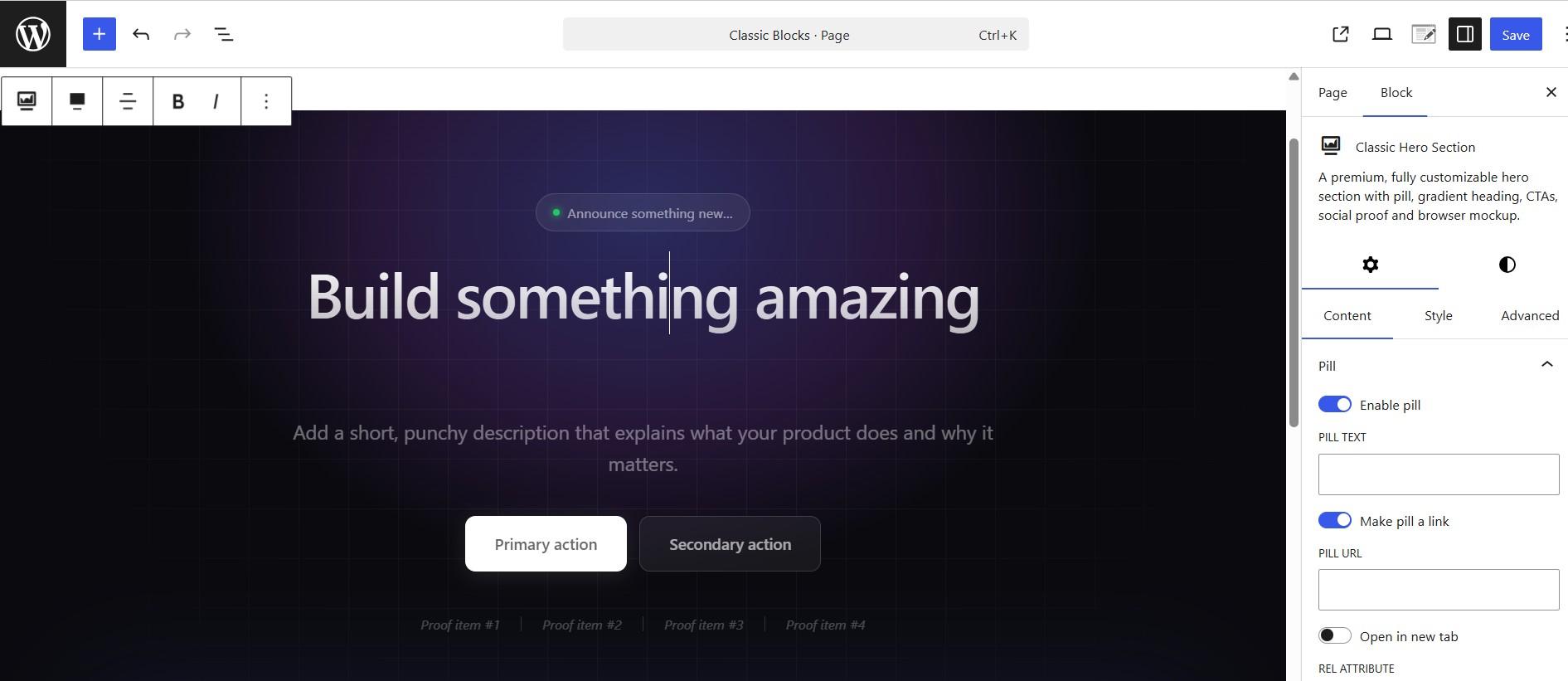
- Classic Hero Section — a fully customizable hero with pill, gradient heading, two CTAs, animated proof bar and a browser-mockup image.
- Classic Testimonial — a review card with quote, star rating, avatar and author details. Drop several into a Columns layout for a testimonial wall.
- Classic Team Member — a staff/profile card with photo, name, role, short bio and social links (X, Facebook, Instagram, LinkedIn, YouTube, website, email).
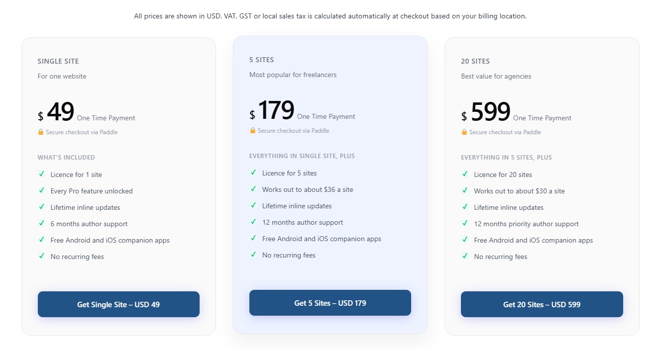
- Classic Pricing Box — a pricing plan card (name, price, features, badge, featured style) with a flexible CTA — a link or a JS button with custom id, classes and data-attributes (works with Paddle.js and similar).
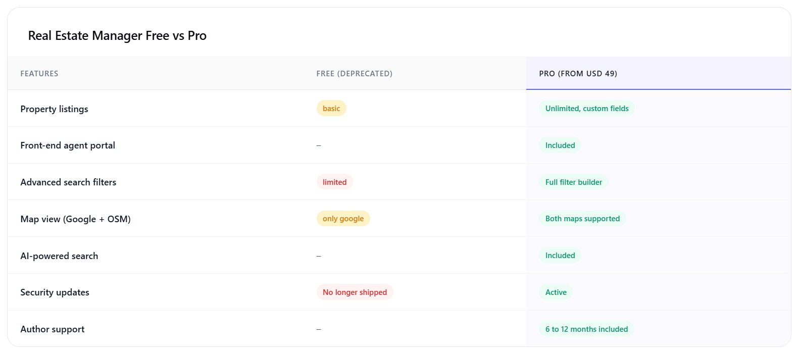
- Classic Comparison Table — feature-by-feature comparison with a highlighted column, good/bad/meh status pills and an optional in-card header and footnote.
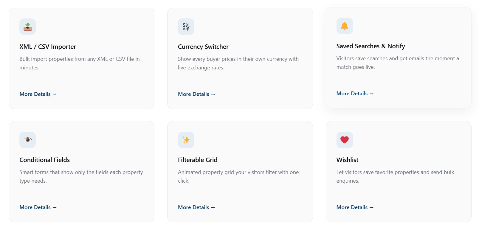
- Classic Info Box — feature card with an icon (dashicon / image / emoji / custom SVG), title, description, optional link and 5 style variations.
- Classic FAQ — an accessible accordion (native details/summary) with optional FAQPage JSON-LD schema for rich results.
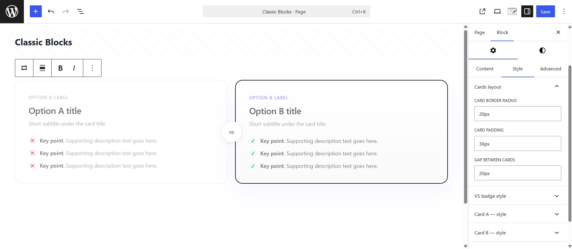
- Classic Versus Box — head-to-head two-card layout with an optional “VS” badge, custom item icons and ribbon badges.
- Classic Eyebrow — a small pill/label for section headers: alignment, optional link, icon (dashicon / image / emoji / SVG), colors, background, border and typography.
- Classic Section — a full-width container/row with background (color / gradient / image / overlay) and an adjustable inner content max-width. Drop any blocks inside.
Built for performance and quality
- Dynamic PHP rendering via render callbacks (lean, secure, cache-friendly).
- Frontend and editor assets are separated, and styles are enqueued the WordPress way (
wp_add_inline_style). - Block style variations (Light / Dark / Elevated and more) across most blocks.
- Reusable controls — typography, spacing, color, gradient, icon picker and a responsive helper.
- Follows the WordPress Coding Standards with full escaping, sanitization and i18n.
Source Code & Build Process
This plugin is fully open source (GPL-2.0-or-later). The complete, human-readable
source for every compiled asset is bundled inside the plugin in the /src
directory. The minified files in /build are generated from /src using the
official @wordpress/scripts toolchain (webpack under the hood) — no other build
tools are required.
To regenerate the compiled assets from source:
npm install— installs the build dependencies declared inpackage.json.npm run build— compiles/srcinto/build.
Use npm start for a watched development build. There is no obfuscation; the
build step only bundles and minifies the JavaScript and SCSS that ships in /src.
Screenshots
Blocks
This plugin provides 10 blocks.
- Classic Hero Section A premium, fully customizable hero section with pill, gradient heading, CTAs, social proof and browser mockup.
- Classic Team Member A team / staff profile card with photo, name, role, short bio and social links. Composable — drop several into a Columns or Grid layout.
- Classic Versus Box Two-card head-to-head comparison with optional VS badge, recommended ribbon and checklists. Compose it inside a Classic Section.
- Classic Section A full-width section/container with background controls and an adjustable inner content max-width. Drop columns, info boxes or any blocks inside.
- Classic Info Box A polished feature/info card with an icon, image or emoji, customizable title, description and optional link.
- Classic Eyebrow A small pill/label (eyebrow) for section headers, with alignment, optional link, icon, colors, background and typography controls.
- Classic Pricing Box A single pricing plan card — name, price, features, badge and a flexible CTA (link or JS button with custom data-attributes). Drop several into a Columns or Grid layout.
- Classic Comparison Table Feature-by-feature comparison table with highlighted column, status pills and an optional table header and footnote. Compose it inside a Classic Section.
- Classic FAQ An accessible accordion FAQ list (native details/summary) with optional FAQPage schema. No heading or section chrome — compose it inside a Classic Section.
- Classic Testimonial A single testimonial / review card with quote, star rating, avatar and author details. Composable — drop several into a Columns or Grid layout.
መጫን
- In your WordPress admin go to Plugins Add New, search for “ClassicAddons Content Blocks”, then click Install and Activate. (Or upload the
classicaddons-content-blocksfolder to/wp-content/plugins/.) - Open any page or post in the block editor.
- Click the + inserter and search for a block name (e.g. “Testimonial”) or browse the ClassicAddons category.
- Add the block and customize it from the Content / Style / Advanced inspector tabs.
If you install from source, run npm install && npm run build inside the plugin directory first (see below).
የተለመዱ ጥያቄዎች
-
Do I need a page builder to use these blocks?
-
No. Everything runs inside the native WordPress block editor. There is no separate builder, canvas or lock-in — just standard blocks.
-
Will this slow down my site?
-
No. Blocks render on the server with no frontend JavaScript, and each block’s CSS is only loaded on pages where the block is used.
-
Is it compatible with Full Site Editing (FSE) and block themes?
-
Yes. The blocks use
block.json, the Block Supports API and standard WordPress hooks, so they work in the post editor and the Site Editor. -
Can I build a testimonials or team grid?
-
Yes. The Testimonial and Team Member blocks are composable — add a core Columns or Grid block and drop several inside. Cards stretch to equal height automatically.
-
X (Twitter), Facebook, Instagram, LinkedIn, YouTube, a generic website link and email.
-
Can I change the heading tag for SEO?
-
Yes — heading tags are selectable (H1 through H6, or div) so you keep a correct document outline.
-
Does it work with my theme’s colors?
-
Yes. Color and gradient pickers inherit your active theme palette, and you can always set custom values.
-
Is the plugin translation ready?
-
Yes. All strings are internationalized and a translation template (
.pot) is included.
Reviews
There are no reviews for this plugin.
Contributors & Developers
“ClassicAddons Content Blocks” is open source software. The following people have contributed to this plugin.
Contributors
Translate “ClassicAddons Content Blocks” into your language.
Interested in development?
Browse the code, check out the SVN repository, or subscribe to the development log by RSS.
Changelog
1.2
- New block: Classic Testimonial — review card with quote, star rating, avatar and author details, plus Light/Dark/Elevated styles.
- New block: Classic Team Member — profile card with photo, name, role, bio and SVG social links (rounded / circle / square icons), photo-top / photo-left / full-width cover layouts, and Light/Dark/Elevated styles.
- Icons: Dashicons now load correctly on the front end; Eyebrow and Hero pill gained image / emoji / custom SVG icon sources.
- Hero: added a “Make pill a link” toggle and a default H1 heading.
- Comparison Table: removed columns no longer reappear on the front end.
- Info Box & Team Member: inline links now work in body text on the front end.
- Inline block CSS is now enqueued via
wp_add_inline_style()instead of inline style tags.
1.0.0
- Initial release with eight blocks: Classic Section, Classic Hero Section, Classic Eyebrow, Classic Versus Box, Classic Comparison Table, Classic Info Box, Classic FAQ and Classic Pricing Box.
- Reusable component library (typography, spacing, responsive, color, gradient, icon picker).
- Block style variations across most blocks.
- Optional FAQPage (JSON-LD) structured data on the FAQ block.
- PHP 8+ namespaced architecture, autoloader, extensible block registry.